CSTO
TIMELINE
1.5 years
INDUSTRY
Non-profit
PROJECT TYPE
Client, UX/UI Design, Photography
ROLE
Web Designer, Photographer
TOOL(S) USED
Figma, Adobe Photoshop
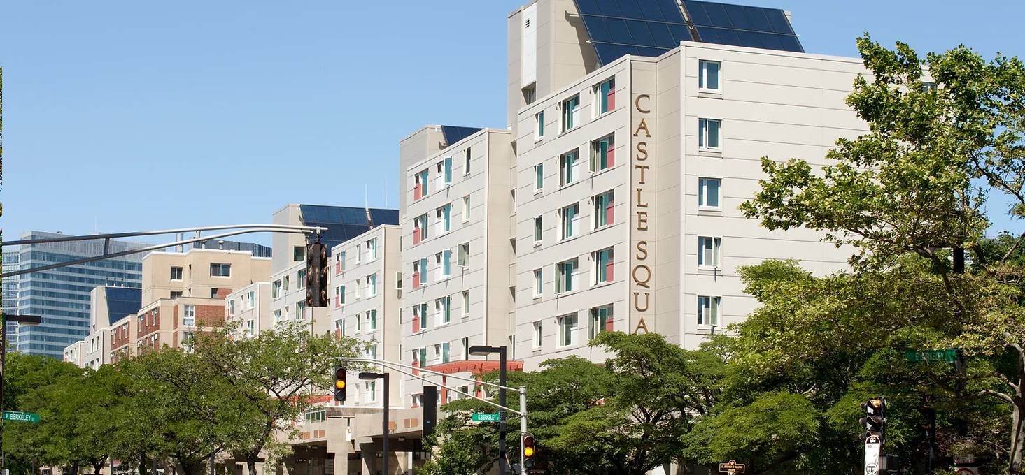
Castle Square Tenants Organization (CSTO) is a nonprofit group based in Boston, MA, dedicated to preserving affordable housing and fostering community empowerment.
Background
CSTO's website needed a complete refresh, both in design and content, to create a more modern and user-friendly experience.
Problem
To redesign CSTO’s website with a modern, accessible look and feel while making it easier for visitors to find essential information.
Goal
A comprehensive website redesign, focusing on a cleaner layout, updated visuals, and improved navigation to enhance user experience.
Solution
IDENTIFY
I collaborated with my client to define expectations for the redesign and establish early project goals. Our focus was on refining the information architecture, elevating the website’s visual style, and refreshing its content.
Design Issues
The design feels outdated and lacks alignment with the brand identity, with a busy background and inconsistent text and image placement.
Poor readability due to small text size, excessive colors, and inconsistent icons across pages.
Overloaded navigation and redundant content; many pages could be consolidated for better flow.
Some buttons are non-functional without visual indicators, leading to confusion.
RESEARCH

Clean and modern layout with clear calls to action, but the homepage feels text-heavy, making it harder to scan key information quickly.
Boston Debates League

Strong visual storytelling with engaging images, but navigation is cluttered, making it difficult to find specific programs.
BCNC

Warm and inviting design that aligns well with its mission, but some pages have long blocks of text that could be more visually structured for readability.
Big Sister Boston

Comprehensive resource hub with well-organized content, but the overall design feels outdated and could benefit from better typography and spacing.
ABCD
Ensure clear and intuitive navigation by organizing content effectively and avoiding clutter, making it easy for users to find key information.
Maintain a modern, visually appealing design that aligns with the organization’s mission while prioritizing readability through well-structured text and consistent typography.
Insight
DEFINE
I worked closely with program managers and staff to refine the website’s content, gathering updated program information, sourcing new images, and coordinating a time to take additional photos. Throughout the development and testing phases, I held monthly meetings with the board of directors to collect feedback and ensure the website aligned with their expectations and needs.
Below are key notes from this process:
Sitemap
After analyzing the structure of the old website, I streamlined the navigation by removing outdated pages and sections that no longer served a purpose. I also grouped related content, such as consolidating all programs under a single navigation tab, to improve usability and organization. These changes create a more intuitive browsing experience, allowing users to quickly access key information, while also ensuring the site remains focused and easy to navigate.
BRANDING
The old website lacked the branding colors and values that reflect the non-profit's identity, so I decided to revamp the color palette, typeface, and UI to better align with the organization’s mission and vision.
Color
I chose to align the website's color scheme with the colors featured in their logo to create a cohesive and unified design.


Typeface
I applied a similar approach to the typography. For the primary typeface, I chose Caudex, which closely mirrors the typeface used on their outdoor signboard. For the secondary typeface, I selected Avenir to complement the style of their logo, ensuring a cohesive and consistent design throughout.


FINAL DESIGN
After finalizing the website design, I delivered the final assets to the client, who appreciated the new direction. They implemented the design in a way that best suited their needs while maintaining the key improvements I introduced.
Below, you’ll find:
A preview of selected pages from my final design
A link to my Figma file showcasing the full design
A link to the live website, as implemented by the client
Home
About Us
Family & Community
Youth, ages 14-19
Contact Us
Square Roots
Change Creators
Joy Club & Seniors
REFLECTION
This was my first experience working with a client, and it came with valuable learning opportunities. Coordinating with multiple stakeholders required patience and adaptability, especially when it came to scheduling meetings and awaiting feedback. Collaborating with clients who were unfamiliar with design challenged me to communicate my ideas more effectively while also understanding their perspectives. In the end, I was pleased with how the website turned out, even though the final live version had some unexpected changes. This experience reinforced the importance of flexibility and setting clear expectations throughout the process.
Takeaways
I really enjoyed working on web design and want to continue expanding my skills. This project sparked my curiosity to learn more about creating user-friendly, visually appealing websites. Moving forward, I plan to deepen my knowledge, refine my technical skills, and explore new tools to create more impactful digital experiences.
Next Steps
Other Projects

Lina Family Daycare

YesStyle

tripmate

bookSwipe